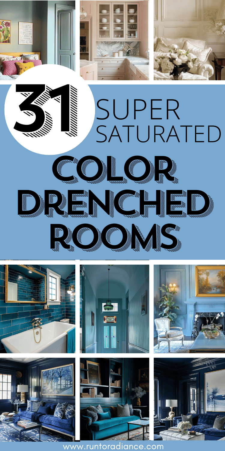
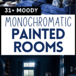
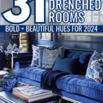
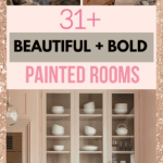
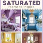
Color Drenching 101: Do This, NOT That
This post may contain affiliate links. As an Amazon Associate I earn from qualifying purchases.


Let’s be honest. I love a soothing color palette, but sometimes you just need some COLOR! If you agree, allow me to (re) introduce you to the wonderful world of color drenching.

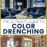
Color drenching is the interior design trend taking over—and for good reason! This technique is all about committing to a single hue, covering your walls, ceilings, trim, and even furniture in one gorgeous, saturated color.
The result? A bold, cohesive, and seriously stylish space.
Whether you’re craving a moody retreat, a cozy cocoon, or a high-end designer look, color drenching is a game-changer.
Let’s dive in and figure out how to make this trend work in your home!
Psst…this post is full of info! If you are looking for something in particular, use the table of contents to skip ahead!
What is Color Drenching?
Color drenching is a stylish home decor technique that involves covering a room with a single paint color to create a bold, intensely pigmented space.
It’s about immersing yourself in color, from floor to ceiling (and everything in between!).
Color drenching isn’t just about picking out a paint color – it’s a flamboyant and fun way of giving your home a character overhaul!
Done well, this trend packs a wallop of personal style into every brushstroke.
When done right, you can transform a room from the ordinary to the extraordinary, elevating your mood and the aesthetic of your abode in one fell swoop!
The Benefits of Color Drenching
So, let’s break it down room by room. Not every room is created equal concerning color saturation. Some rooms naturally lend themselves to a deeper dive into drenching, while others call for a more restrained approach.
Either way, once you’ve chosen your color, don’t forget to nail your best trim colors — it makes or breaks the whole look!
Here are my top picks for a good color drench:
Living Room Color Drenching
The living room is prime real estate for this trend!
Whether you’re drawn to rich, moody hues or soft neutrals, drenching your space in color can take it from “nice” to “next level.”
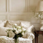
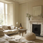
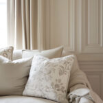
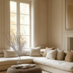
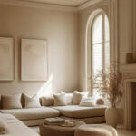
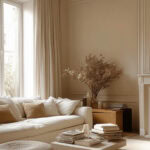
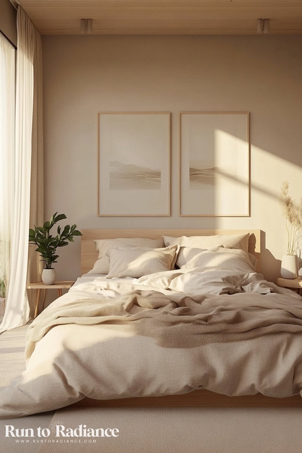
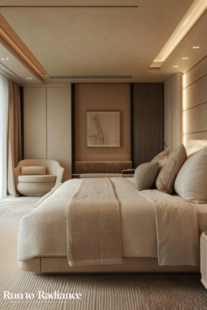
Warm Neutrals
Beige, taupe, or greige are perfect for those who want a softer approach to color drenching.
These hues keep things elegant and timeless while still making a strong visual impact.
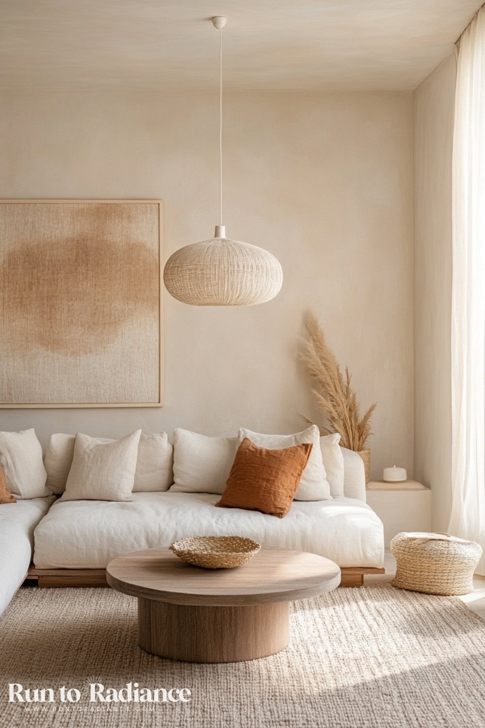
A cream-colored sectional with linen-textured throw pillows and a woven pendant light enhances the airy and organic feel of the space.
Pair it with a jute area rug for added warmth and texture.
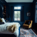
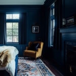
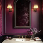
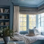
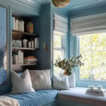
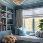
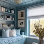
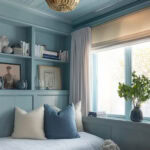
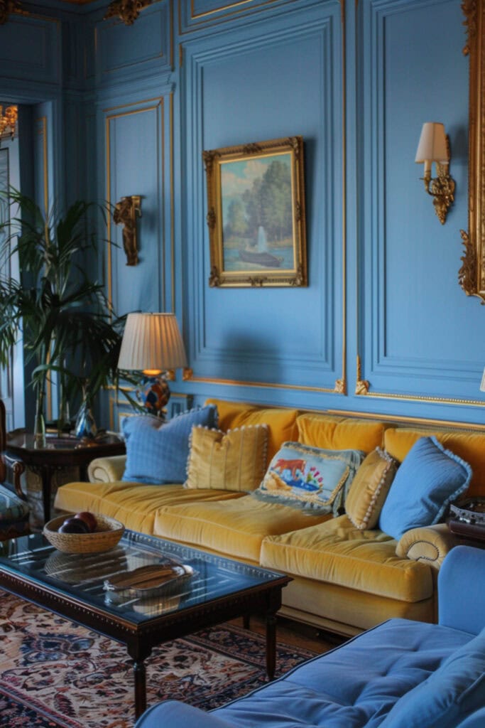
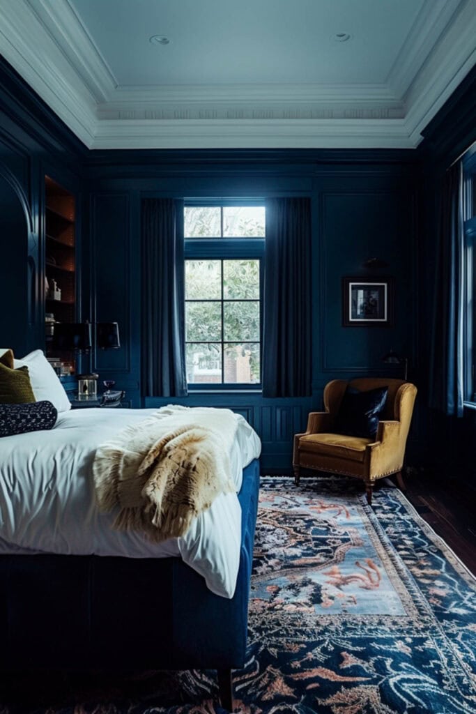
Blue
There are so many beautiful shades of blue out there, and you’d be hard-pressed to find a more versatile, classic color to go monochrome with!
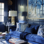
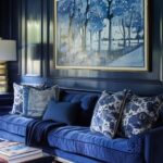
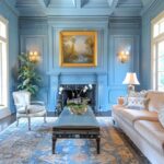
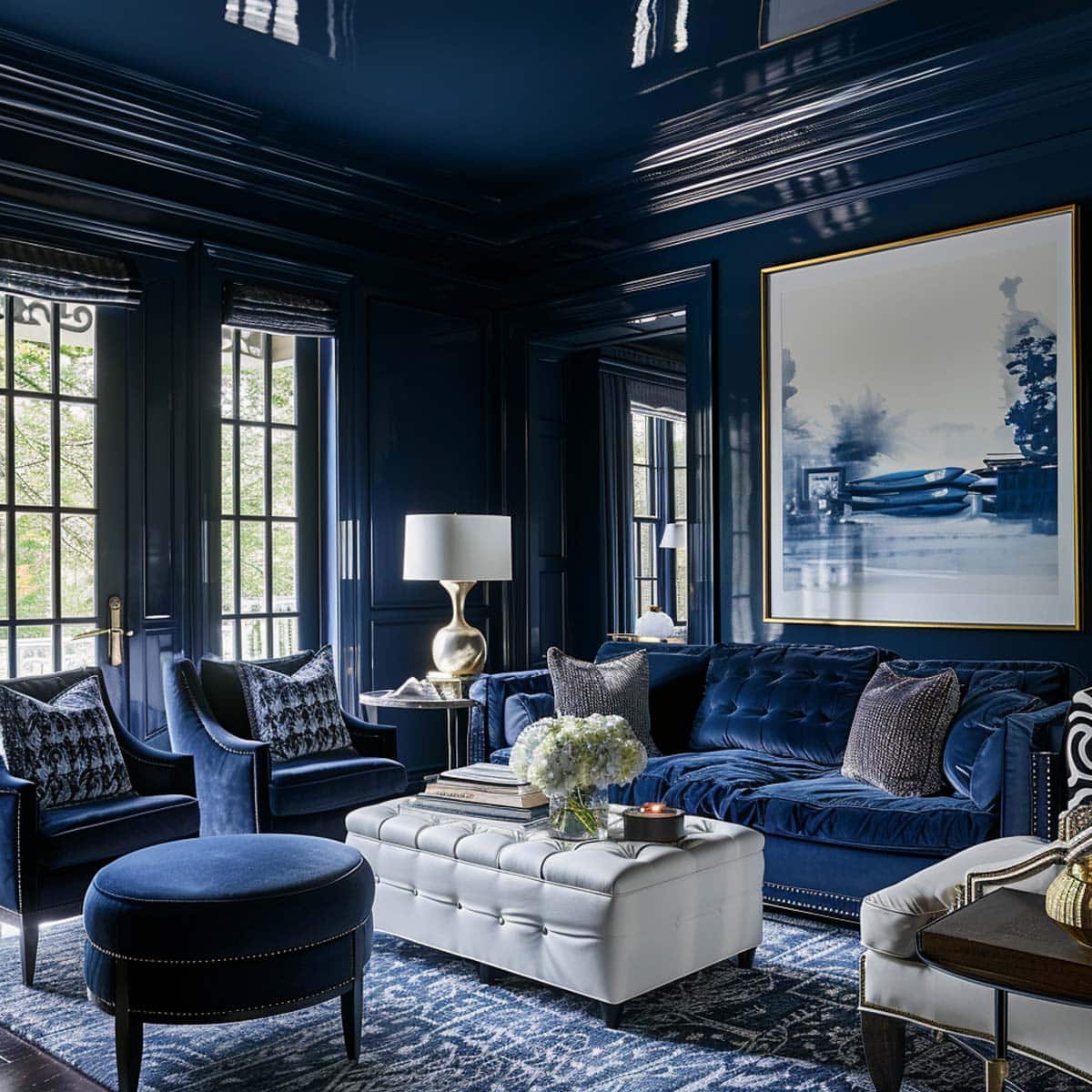
A deep navy adds a classic and refined feel to any space.
I personally think it works exceptionally well in rooms with lots of natural light for a bold yet balanced aesthetic.
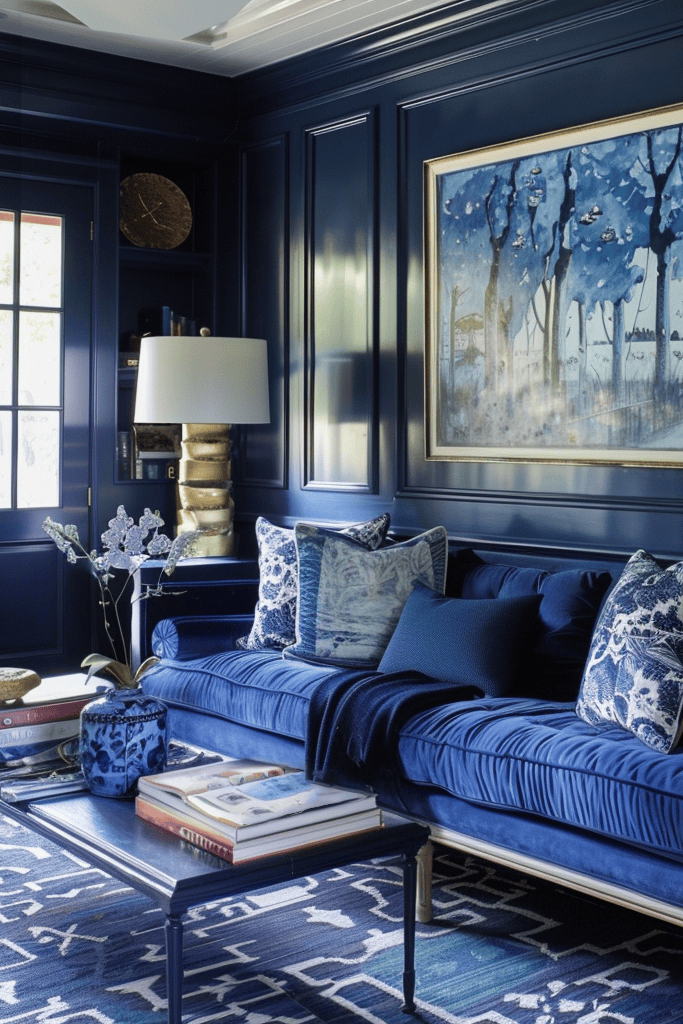
A navy blue velvet sofa with pretty patterned pillows make for a luxurious and cohesive look. Then, kick the glam factor up a knotch with oversized blue toned art and gold-accented lighting.
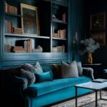
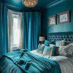
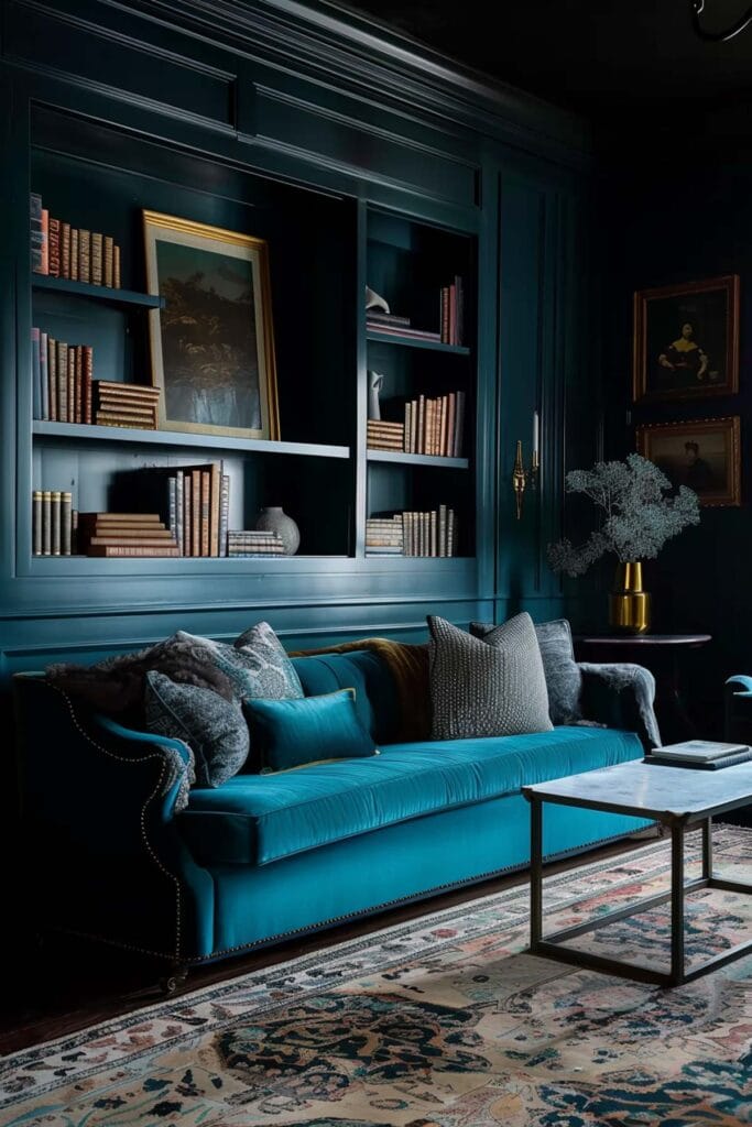
I also love the idea of a pretty teal blue room. It adds an air of modern style while still giving that old-money vibe!
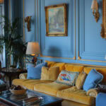
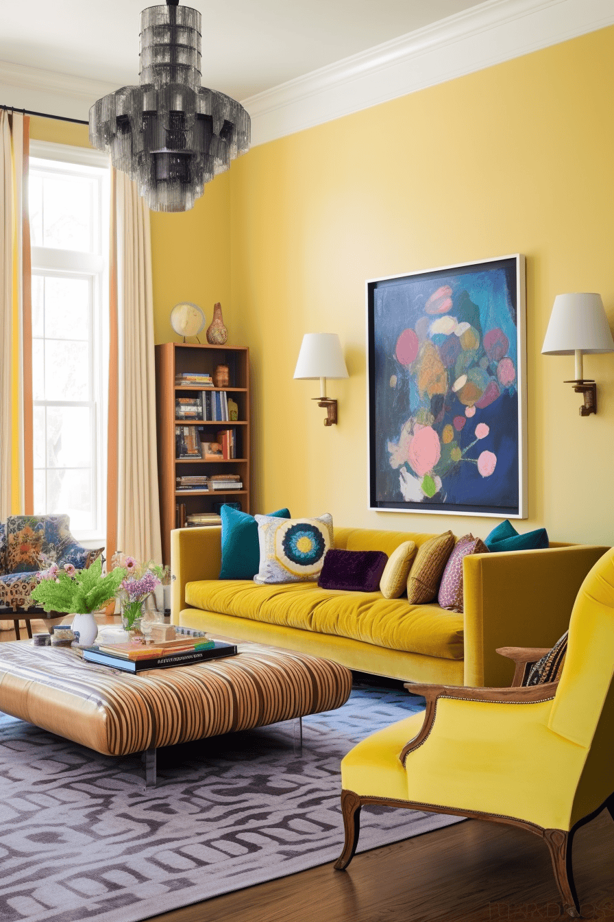
Prefer pastels? Go with a light blue. This hue offers a fresh, airy take on color drenching.
I love the velvet mustard-yellow sofa, too – it adds an unexpected pop of warmth, making the space feel regal yet inviting.
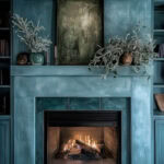
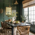
Green
Want to start a somewhat low commitment? Try color-drenching your fireplace for a pop of saturation!
I love how this green fireplace look,s especially when paired with natural wood.
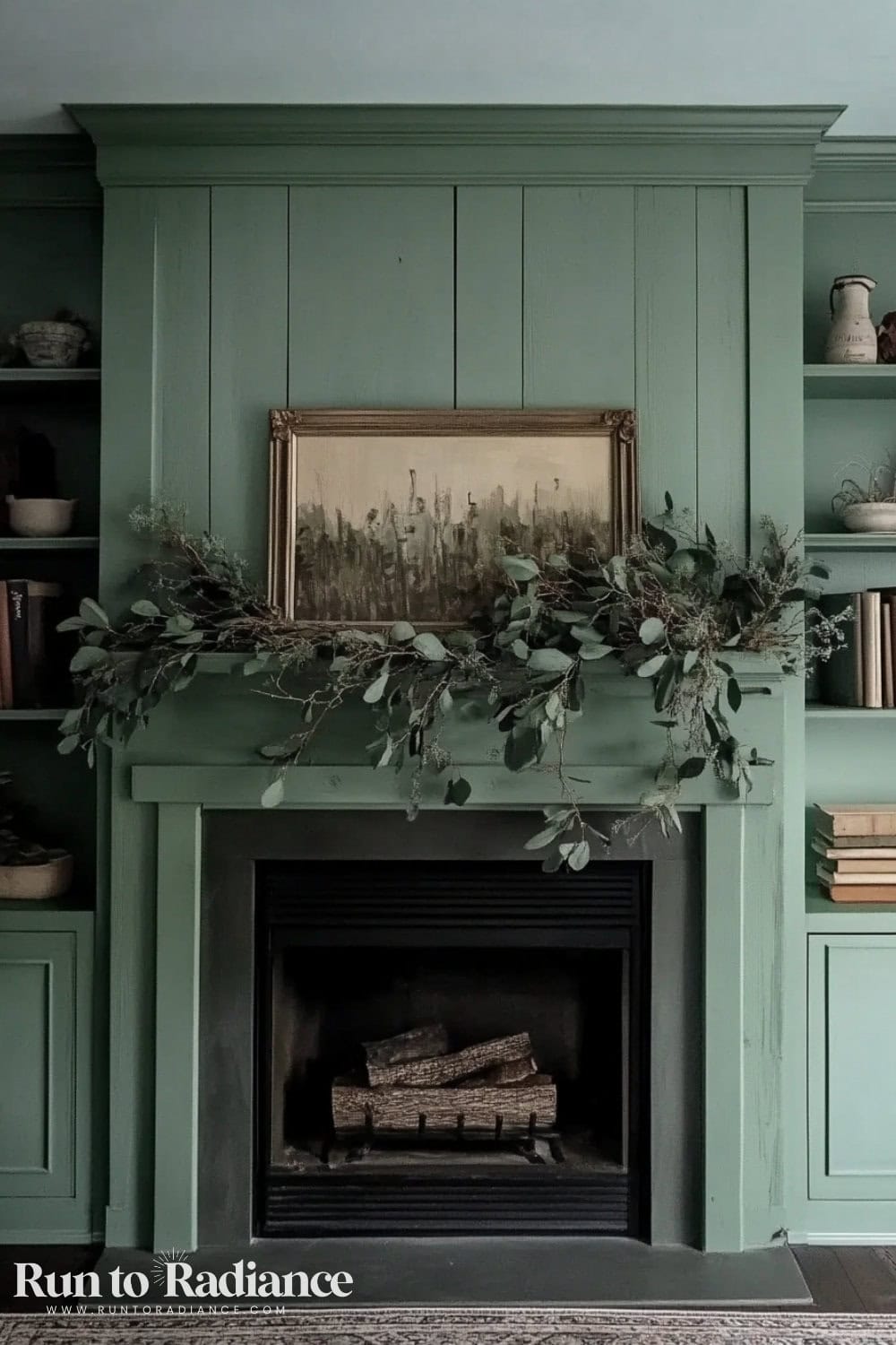
While I went for a whitewashed fireplace in our last home, I am toying with the idea of changing it up after seeing how gorgeous this is!
If you’re not ready to go all in, a green accent wall is a great place to start.
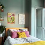
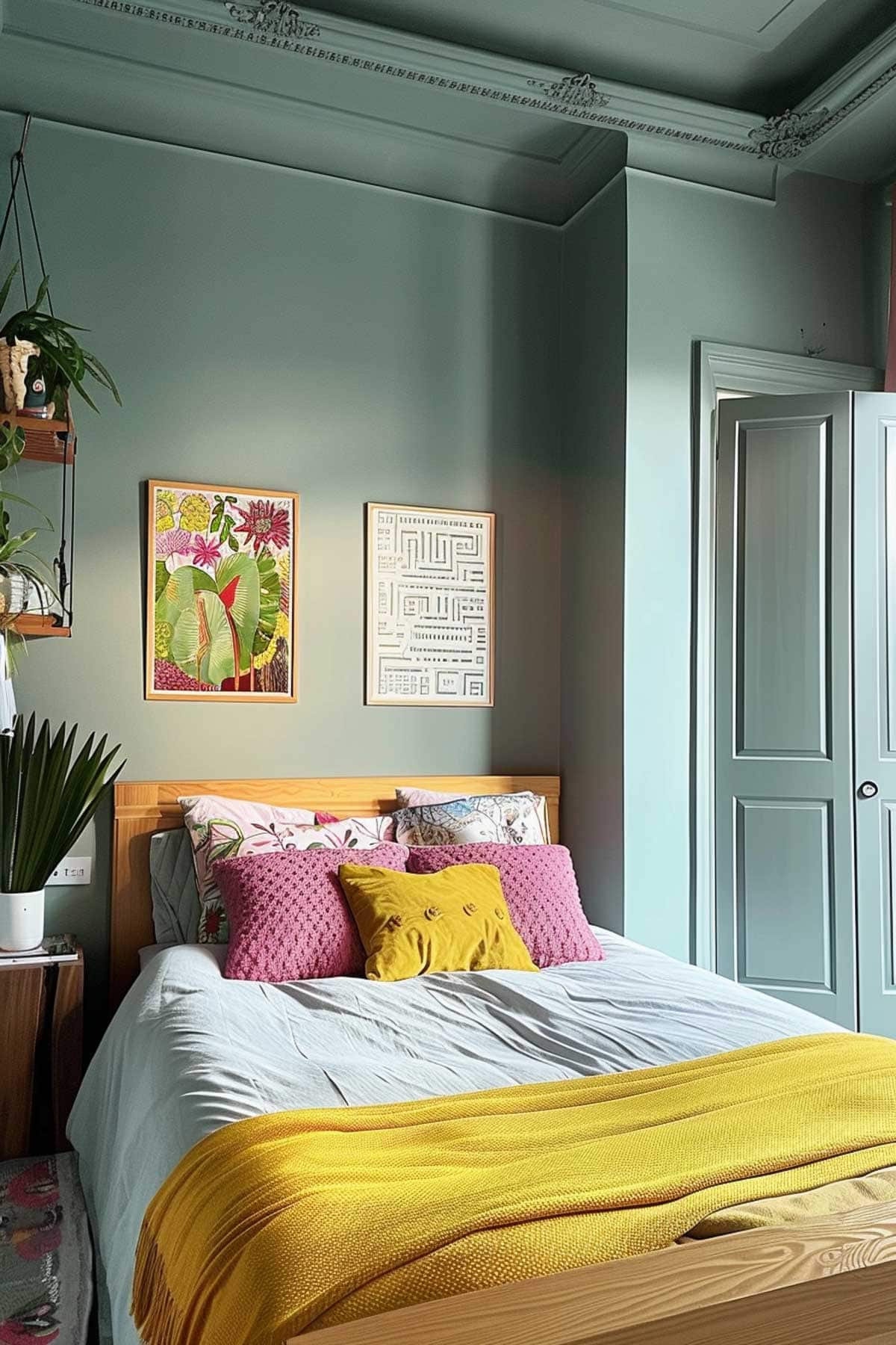
Bedroom
A color-drenched bedroom? YES, PLEASE. Talk about sweet dreams!
Whether you want a peaceful sanctuary or a dramatic statement space, this technique works wonders.
Here are some of my favorite colors to try!
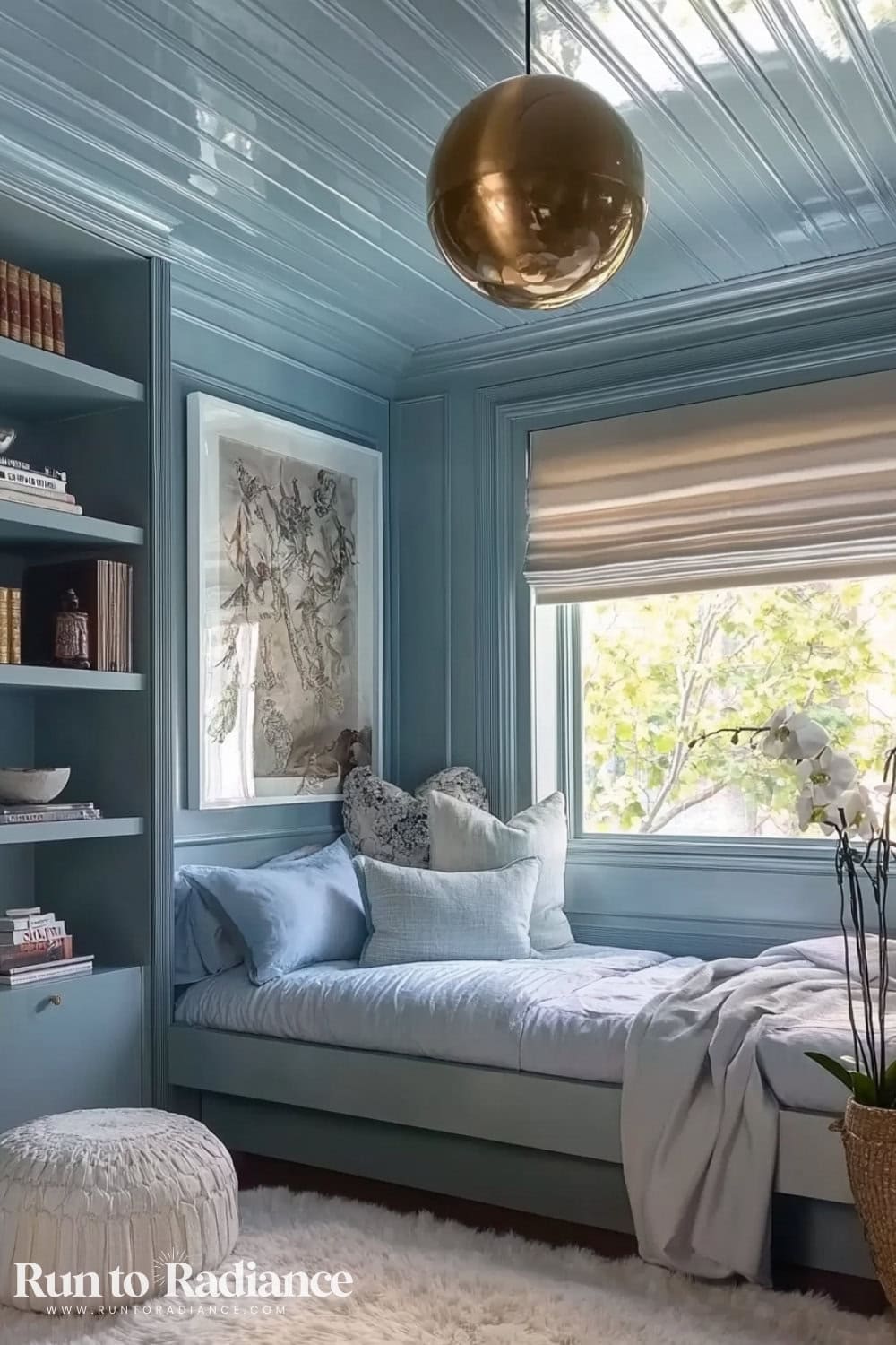
Soft Blue
A dreamy, calming hue that instantly creates a serene retreat. This powder blue is what relaxation is made of!
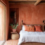
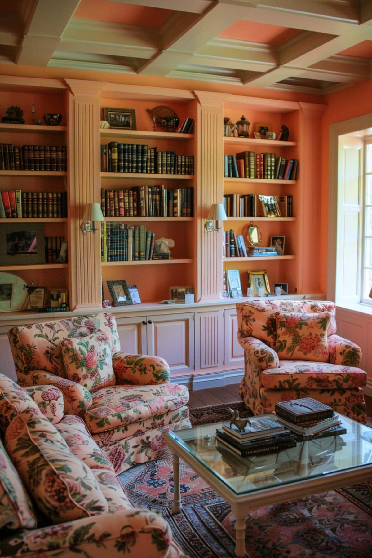
Terracotta or Blush Tones
These earthy shades bring warmth and coziness to a bedroom.
They feel inviting and effortlessly chic, making them a fantastic choice for a cozy and stylish sleep space.
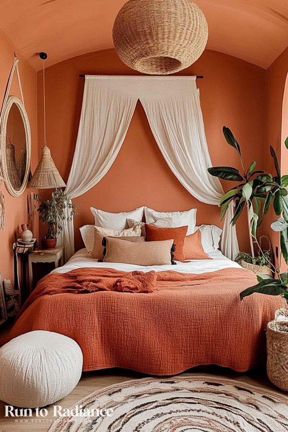
Try terracotta bedding and coordinating throw pillows to complete the boho chic look.
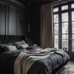
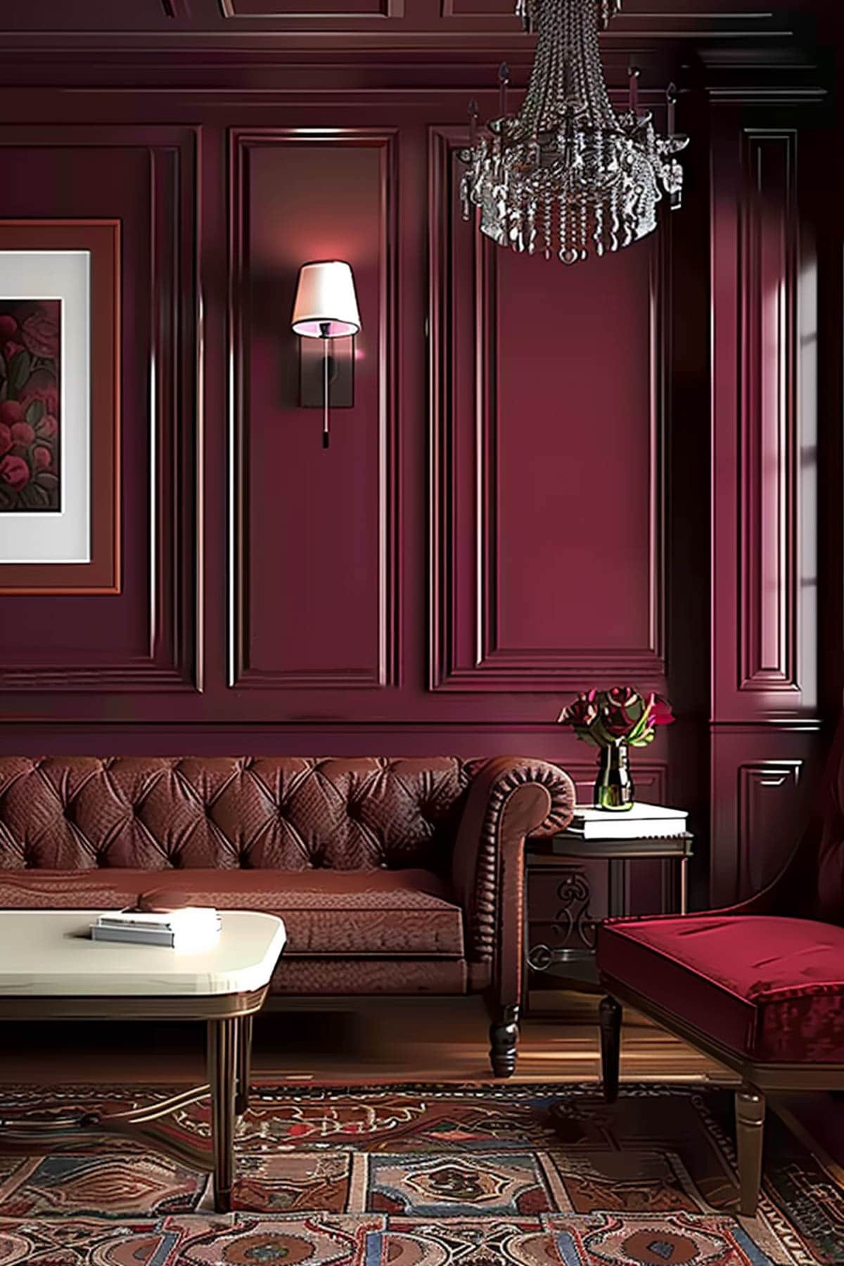
Black
I won’t lie, I LOVE this look! So much so that I wrote an entire blog post about black bedrooms – make sure to take a look if you are feeling this shade!
Black rooms are a total vibe: a moody, luxurious feel that reminds me of a high-end hotel.
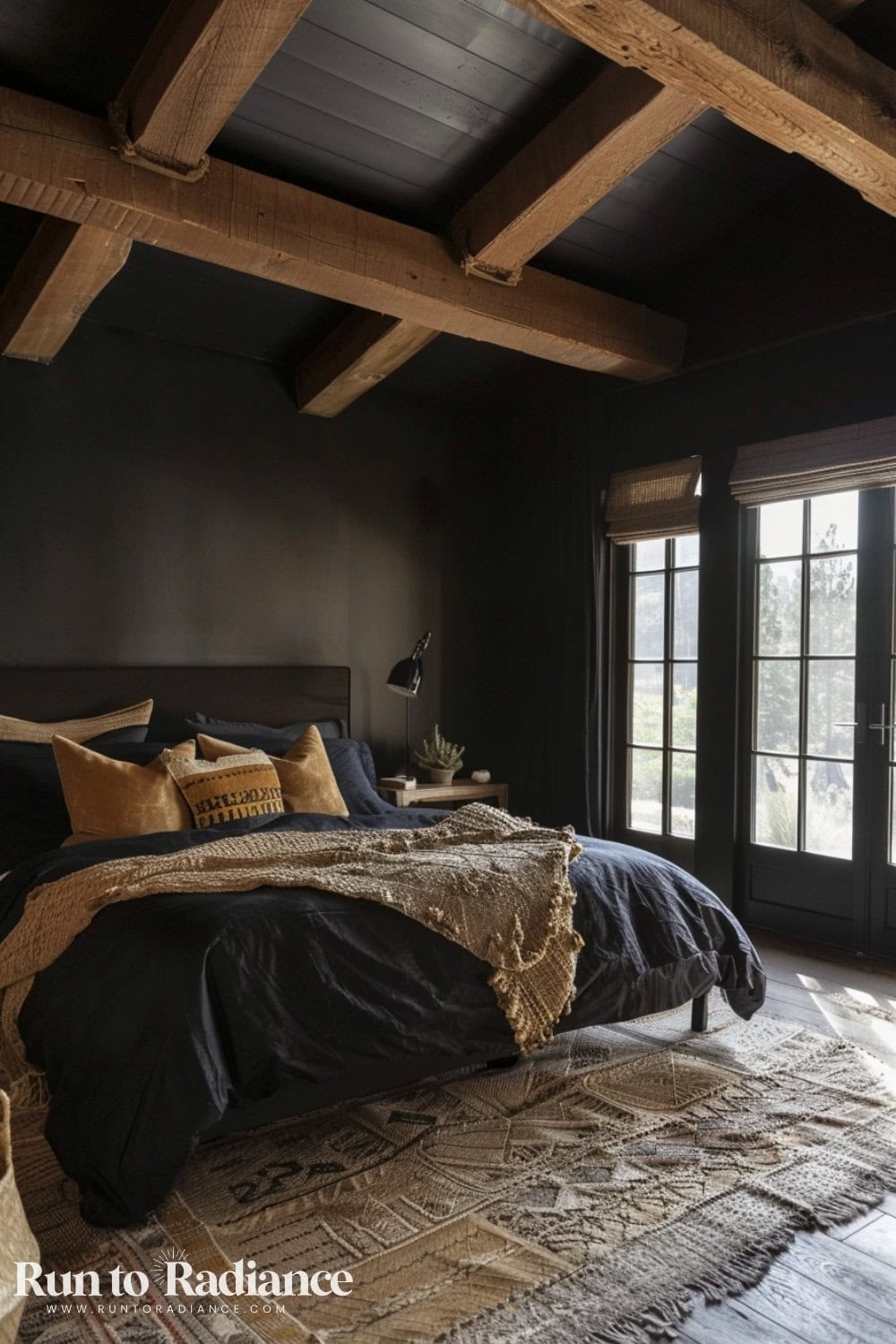
Pair it with earthy throw pillows and a textured rug to soften the effect.
Black color drenching makes the space feel intimate and dramatic, and it is pretty ideal for those who love a sophisticated and modern look.
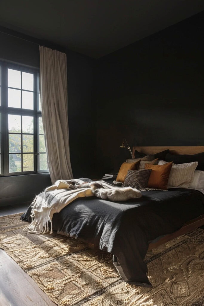
See what I mean about gorgeous?
But, if it’s too much for you, why not dip your toe in and try a black accent wall instead?
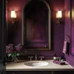
Pink
Alternatively, you could paint your bedroom and make it pretty in pink! This is perfect for a romantic, soft aesthetic.
I love this look so much that I wrote an entire post about pink bedrooms, so check it out for tons of examples!
Whether you opt for a muted blush or a bolder rose, it adds warmth and personality to a space.
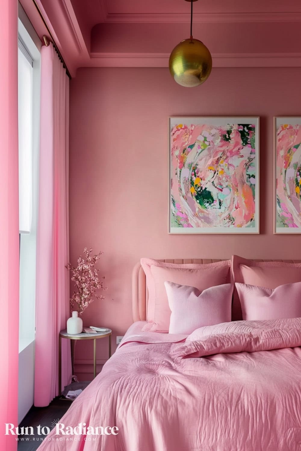
To keep it from feeling overly sweet, mix in gold accents and abstract artwork for a sophisticated touch.
BTW, if you are vibing with a pink bedroom but want it with a touch of castle chic, you’ve got to check out Rococo interior design!
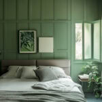
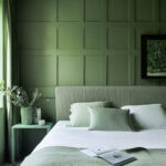
Green
An incredibly versatile choice, from soft sage to deep forest tones.
It brings a sense of calm and connection to nature, making it ideal for bedrooms.
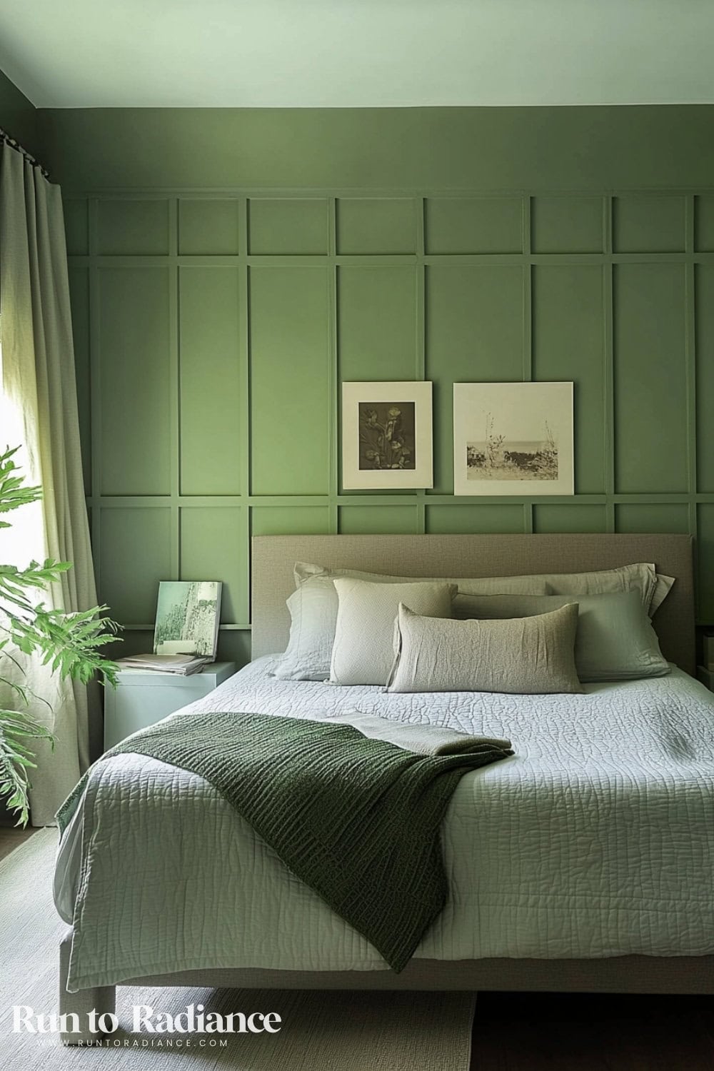
A monochromatic green bedroom with matching bedding, curtains, and side tables creates a truly immersive and relaxing space.
Plus, with the right accessories it can be playful and fun, too!
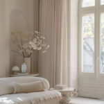
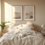
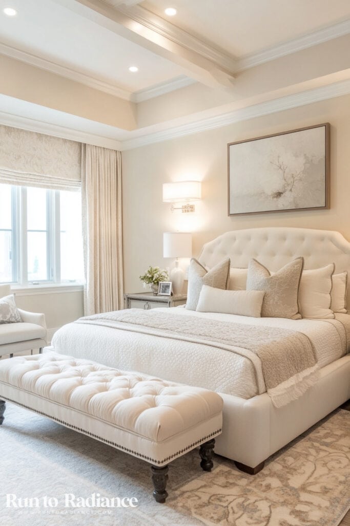
Cream
A warm, elegant alternative to white.
It keeps the room feeling light and airy while adding a touch of softness and coziness.
Layer in textured throws, linen bedding, and woven decor to add depth while maintaining the neutral, airy aesthetic.
Home Office Color Drenching
Your workspace should spark creativity and productivity—so why not use color to make it happen?
Plus, think how awesome you’ll look on your Zoom calls with that pretty paint in the background! 🙂
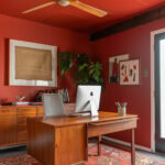
Warm Ochre
A vibrant yet balanced color that brings warmth and energy.
It’s perfect for keeping creativity flowing while still feeling inviting.
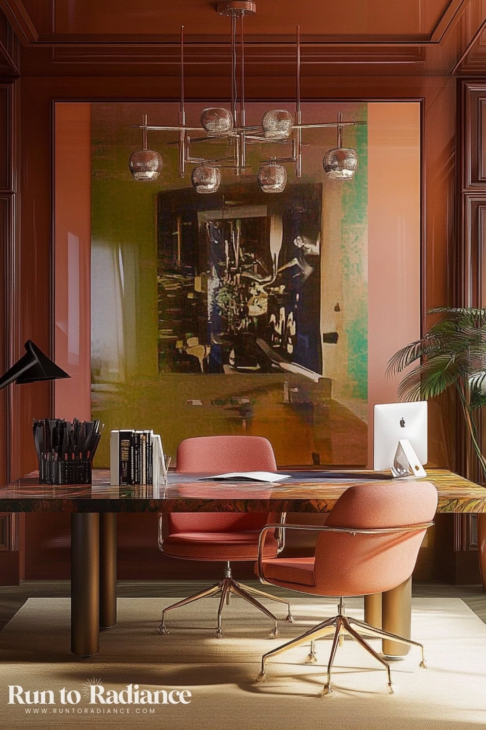
Pair it with wood accents and desk chairs from the same color family to add depth and character.
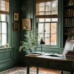
Forest Green
A rich, grounding shade that fosters focus and inspiration.
A monochromatic forest green office, complete with painted built-ins and a matching desk, creates a sophisticated, distraction-free workspace.
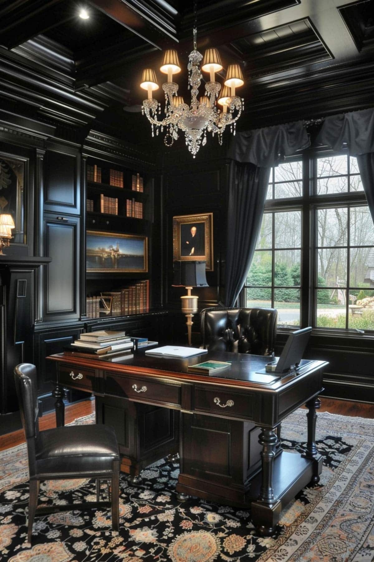
Black
A bold and powerful choice that adds depth and drama to a workspace.
A black color-drenched office, complete with matte black walls and shelving, creates a sleek and high-end look.
To keep it from feeling too heavy, add brass or chrome accents, rich wood furniture, and statement lighting to balance the darkness.
Deep Blue
A go-to for those who want a professional yet serene workspace.
It evokes a sense of calm while maintaining an air of sophistication, making it great for productivity.
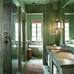
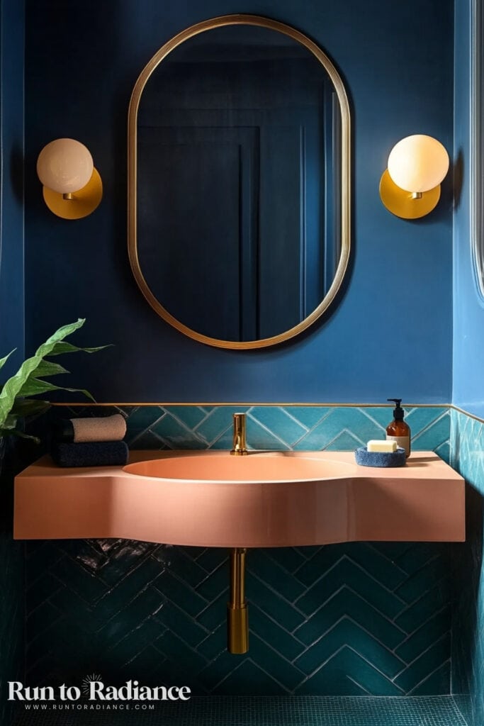
Bathroom
A color-drenched bathroom can feel spa-like, moody, or ultra-modern, depending on your chosen shade.
It’s also one of the best places to try out color drenching, particularly if you have a smaller powder room!
You can pack a lot of personality in with a punch.
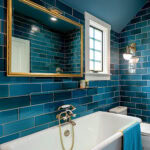
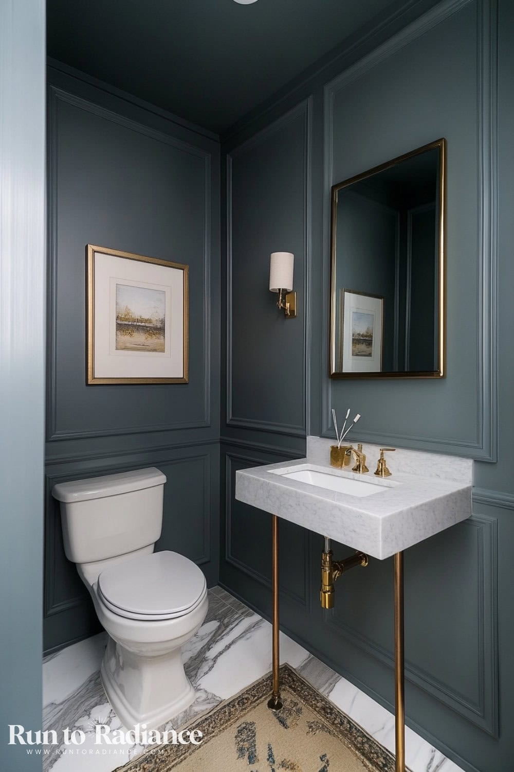
Deep Teal or Emerald
These jewel tones create a bold, luxurious atmosphere.
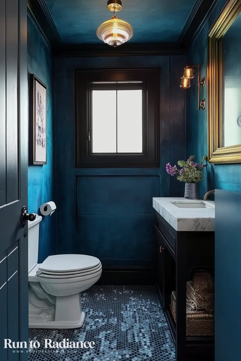
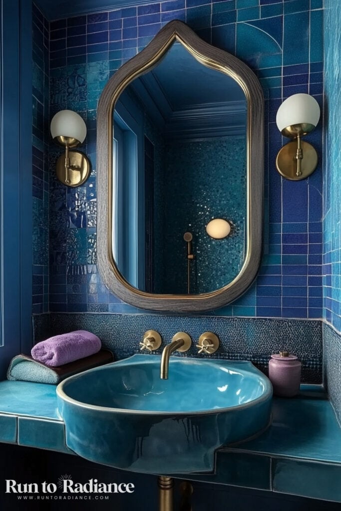
Pair with brass hardware and marble countertops for a boutique hotel feel.
Muted Pink or Terracotta
Soft pink or earthy terracotta makes a bathroom feel warm and inviting.
Try painting the vanity and walls the same shade for a seamless look.
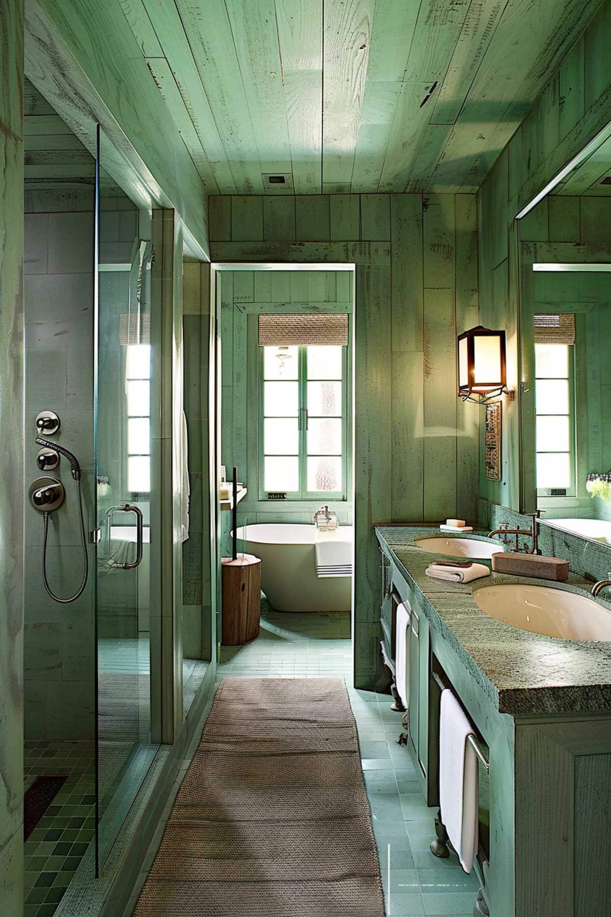
Green
Want to try something unexpected? Go with green! This modern aesthetic gives off definite nature spa vibes.
The Dining Room
Set the stage for fine dining with and use paint to create an intimate dinner atmosphere that wows.
Dining rooms are the perfect space to make a statement with rich, immersive color.
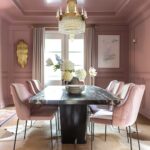
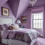
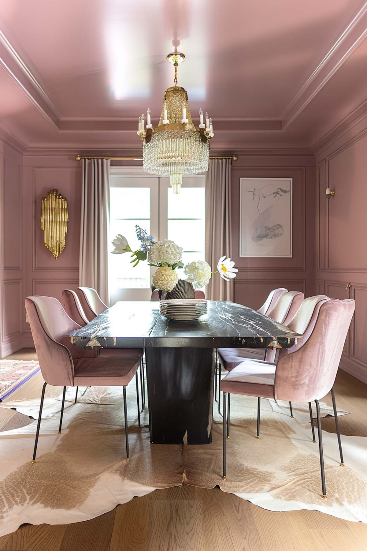
Soft Lilac
A soft lilac dining room feels unexpected yet elegant.
Pair it with crystal chandeliers and gold accents for a luxurious touch.
I’m obsessed with this color and particularly love the matching lilac chairs!
Warm Beige or Taupe
For a cozy and welcoming feel, beige and taupe hues create a soft, intimate atmosphere.
Pair with wooden furniture and textured table linens for warmth.
Navy
For a sophisticated, old-money vibe, go with a deep navy hue. Wrap the color onto the ceiling for bold blue color drenching!
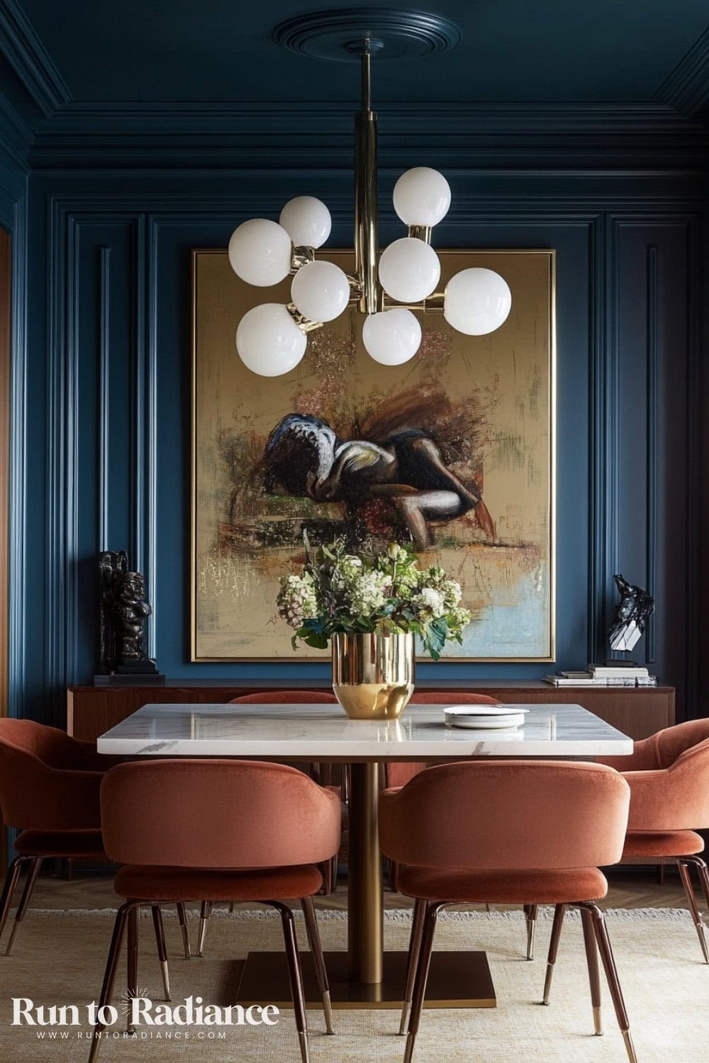
I love how this dining room features orange chairs to ground the blue. These shades look gorgeous together!
Kitchen Color Drenching
Color drenching in the kitchen creates a bold, custom look that makes cabinetry, walls, and ceilings blend seamlessly.
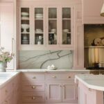
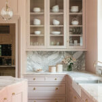
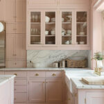
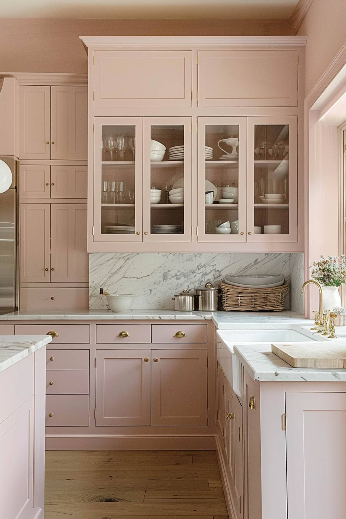
Soft Pink
A soft pink kitchen is a fresh, unexpected choice that feels warm and inviting.
Pair pink cabinetry with brass hardware and marble countertops to keep the space looking chic and modern.
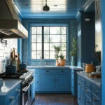
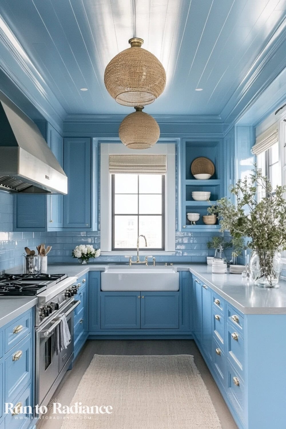
Blue
A navy-drenched kitchen feels timeless and sophisticated. Try painting cabinets and walls in the same shade and adding gold lighting fixtures for contrast.
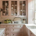
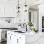
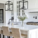
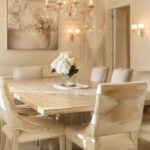
White & Cream
If you’ve been around here for a while, you know I’m a huge fan of an all-white kitchen—it’s what I have in my own home! You can see the before and after of our kitchen here.
White and cream kitchens feel classic, bright, and endlessly versatile.
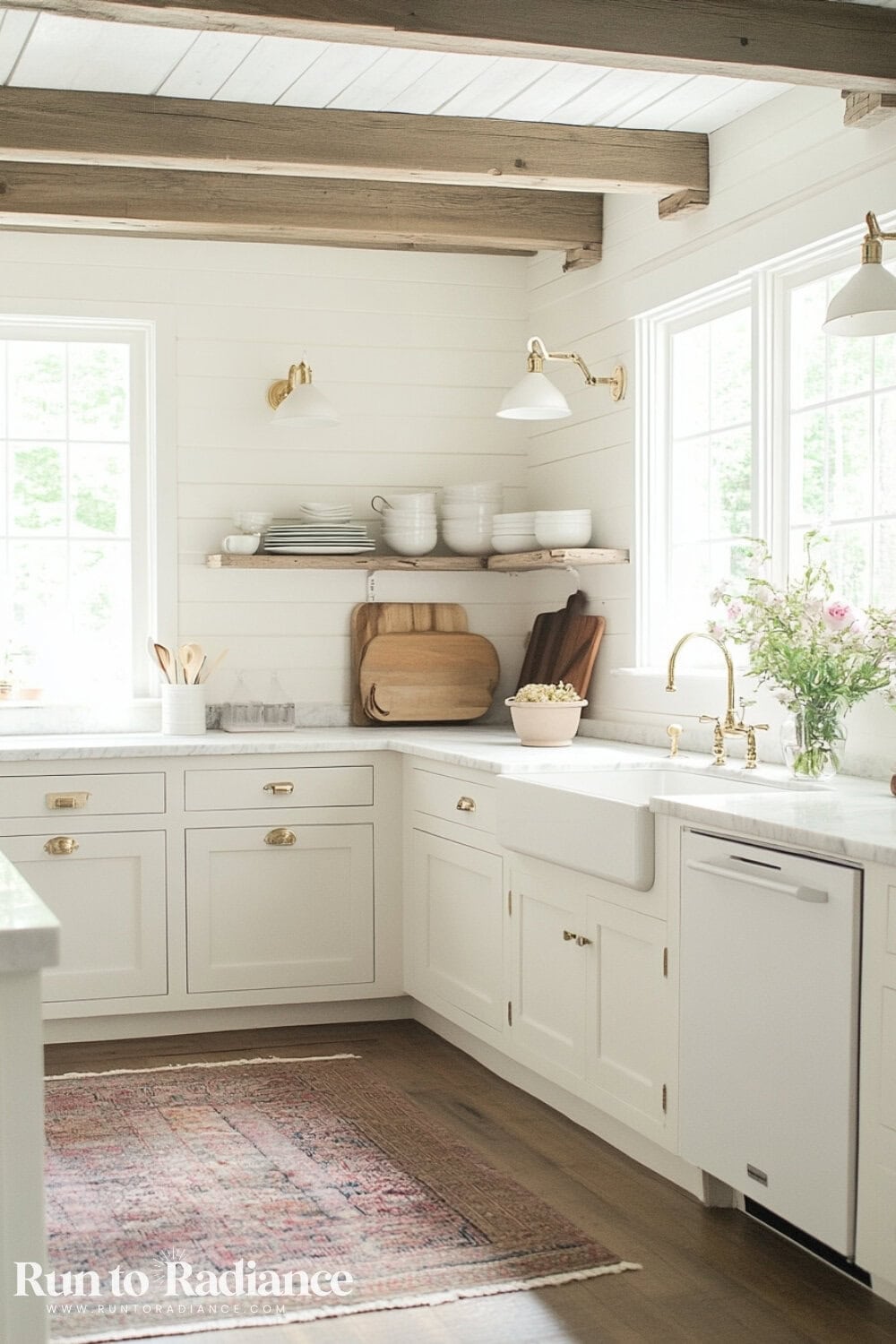
Layering white cabinetry, white walls, and matching white appliances (which I also love!) creates a seamless, airy space.
To keep it from feeling too stark, introduce warm wood accents, textured backsplashes, or brass hardware for added dimension.
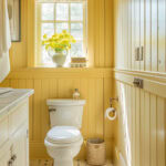
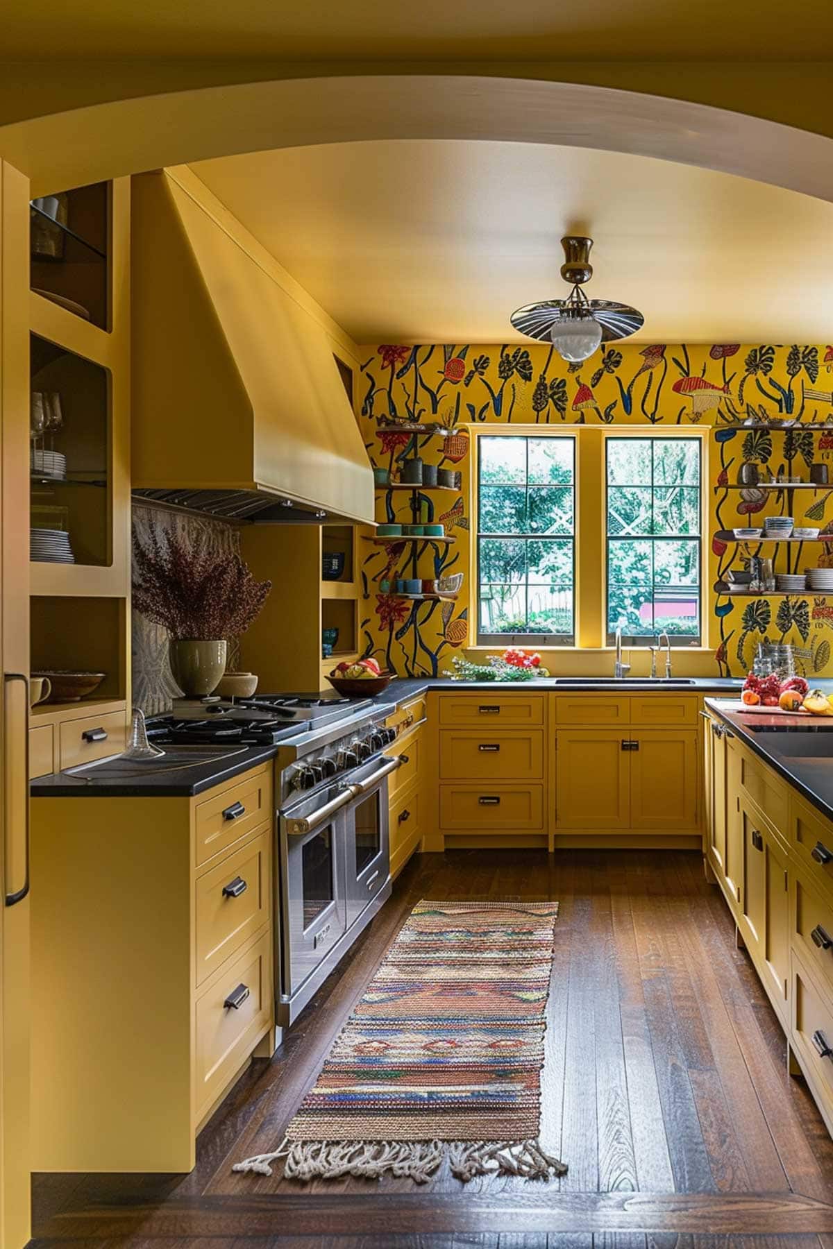
Yellow
This one is a little controversial, but hear me out! Yellow is sunshiney and warm and could be just the right pop of cheer for the heart of your home.
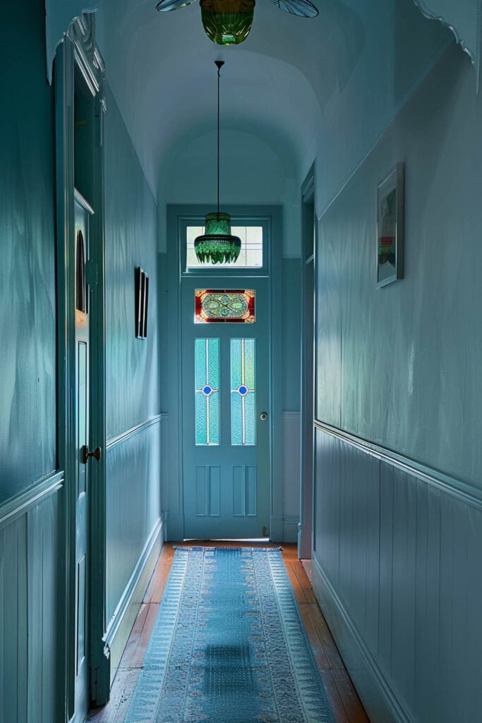
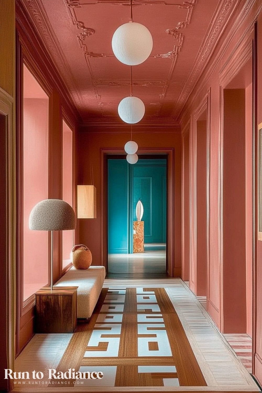
Hallway & Entryway Color Drenching
Entryways and hallways are perfect for color drenching because they set the tone for the rest of your home.
Plus, they are small enough spaces that you can easily repaint if you want a new look!
Deep Blue
A deep blue entryway creates a dramatic first impression.
Pair it with fun lighting or gold accents to keep the look elevated.
Warm Taupe or Beige
For a more subtle, welcoming approach, warm neutrals add depth while keeping the space airy.
Paint the trim, doors, and walls the same color for a seamless, modern look.
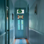
Pink
For a fun pop of unexpected color, why not go with a coral pink?
I love how this juicy color pops in this hallway, especially when contrasted with the more neutral floors and lighting.
How to Master the Art of Color Drenching Step by Step
Now that you know which colors and rooms are the best candidates for this dreamy technique, here are the next steps to take to take your colorful vision from dream to actuality!
1. Choose a Color Palette
Create a cohesive color story for the room. This includes the primary drench color and the complementary tones for furniture and accents.

2. Determine the Focal Point
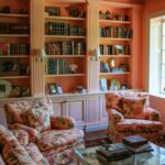
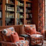
Be strategic about the wall or area you want to highlight. It’s your room’s ‘aha!’ moment. While the goal is to make the entire room “wow,” there’s always one spot the eye is more drawn to.
Hint: color drenching is the perfect excuse to add a gorgeous faux DIY built in bookshelf to your space. 😉
3. Swatch
No matter how eager you are to get to the paint store and buy a few gallons of your new favorite color…stop! Do your research and compile a few options.
I promise you, the color on the screen looks different in your home!
Once you’ve narrowed it down to two or three swatches, paint each sample on a large poster board or right on the wall. Then, move the boards around the room (high & low) and check how they look at different times.
Pleeease don’t skip this step!
Painting your wall is one thing, but painting your ceiling, baseboards, and walls is a whole commitment! Make sure you swatch and watch before diving in! 😉
4. Paint
After you have swatched, and waited, and decided…THEN grab your paint and start drenching! Apply your chosen color to the walls with care.
Multiple coats may be needed to achieve that delightful saturation, so don’t rush the masterpiece!
I recommend starting with the walls, then the ceiling, and lastly painting the trim (here’s how).
5. Layer in complimentary accents
Last but not least, add some neutral tones and complementary accent colors. This creates a dynamic interplay that can make every element pop.
Remember, when in doubt, go with your gut and choose what feels right. After all, it’s your creative expression that we’re unleashing here!
Quick Tips for Color Drenching
FAQs
Does color drenching make a room look bigger?
Yes, it can. By eliminating visual clutter and creating a seamless, cohesive space, color drenching can make even the smallest room feel more expansive.
What’s the difference between monochromatic and color drenching?
They are similar, but slightly different.
While monochromatic design relies on different tones of the same color, color drenching involves saturating a room with one bold, impactful hue.
Is color drenching just a trend?
While it has become more popular the last year or so, it’s definitely not just a trend. Color drenching is a timeless technique that has been used for decades to elevate the mood and aesthetic of a space.
For example, think of those gorgeous rooms in movies like one of my all-time favorites, the 2005 version of Pride and Prejudice. Those rooms are super rich and saturated and definitely committed to one color.
It’s here to stay, so why not give it a try?
Can color drenching be done with wallpaper?
Yes, it can! In fact, wallpaper can add texture and dimension to your drenched walls. Just make sure to choose a pattern that complements your chosen color palette.
What sheen of paint should I use?
That’s up to you! A high gloss finish will create a dramatic, reflective effect, while a matte finish can give off a more understated vibe. Consider the mood and atmosphere you want to create in the room when choosing your paint sheen.
Traditionally, people opt to do an eggshell finish on the walls, flat paint on the ceiling, and a more glossy look for the baseboards. These days, however, all rules are off!
As you can see in the images throughout this post, many people now opt for glossy ceilings and flat walls!

A Final Coat of Encouragement
As you venture forth into the world of color drenching, remember—rules are made to be broken.
Just like everything in the world of home design, I HIGHLY encourage you to throw out the rule book or what the “experts” say. At the end of the day, the only person who has to love your space is YOU.
As always, I want you to love the life (and space!) you create.
This is your home, your sanctuary, your personal art gallery. Let your imagination run wild, and your walls be the canvas of your creative dreams!
So, grab that paint roller, put on some tunes, and let the color drenching begin! Don’t be afraid to play with color…after all, at the end of the day, it’s only paint.
Here’s to a home that’s as vibrant and unique as you are. Happy drenching, friends!
More Posts About Paint
Want to learn even more about painting? Check out these posts for more ideas!