How To Select a Color Scheme for Your Home’s Interior
This post may contain affiliate links. As an Amazon Associate I earn from qualifying purchases.
I don’t mean to be dramatic, but…electing the wrong color scheme for your home can be a total disaster. Your home is where you go to relax and unwind, and the wrong colors can absolutely negatively affect your mood and emotions.
So, how do you select the correct color scheme for your space?
Believe it or not…it all begins with the psychology of color. Colors have an emotional and physical effect on your feelings and behavior. It is essential to select a color scheme that is comforting, calming, stimulating, or inviting, depending on the room in your home.
Understanding color theory and the color wheel can help you pick a color scheme that makes your home comfortable and reflects your personality. Color theory is part art and part science and relies heavily on the color wheel, invented by Isaac Newton. Use these tools to select a color scheme to aid you in selecting wall colors, furniture pieces, and home accessories.
Apply your color scheme using the 60-30-10 decorating rule. To maintain color balance, the dominant color in your scheme should cover 60% of the room, the secondary color should cover 30% of your space, and the remaining 10% is the accent color.
Color Psychology
Color has psychological effects on your mood and behavior. Knowing how specific colors affect your emotions can help in selecting colors for different rooms in your home.
The color in a room sets the ambiance, and selecting the appropriate color for each room in your home is essential.
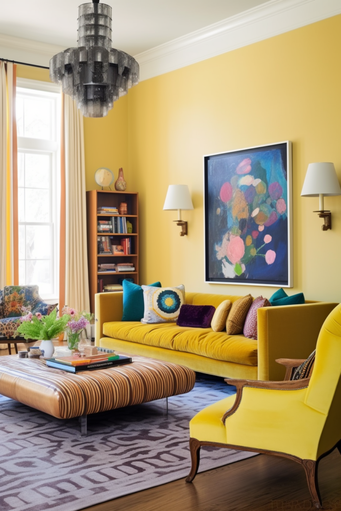
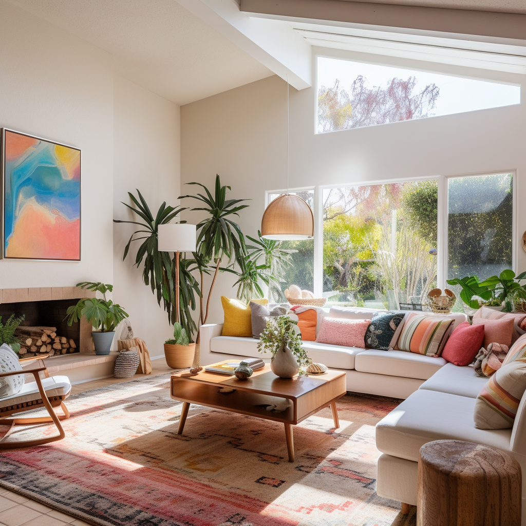
Living Room
Yellow is a happy color and stimulates movement. It is perfect for social spaces like a family room or living room. Red is a great color for accent pieces because of its energizing effect.
Green, as the dominant color in your living room, creates a calming effect. Soft shades of green help you to relax and release stress.
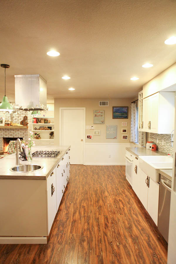
Kitchen
Yellow boosts serotonin levels in the body, which increases the appetite. It also makes the kitchen feel inviting and promotes a joyous feeling.
Shades of blue, white, and gray can give the kitchen a modern, sleek, industrial feel. This color combination promotes calmness.
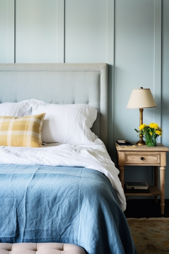
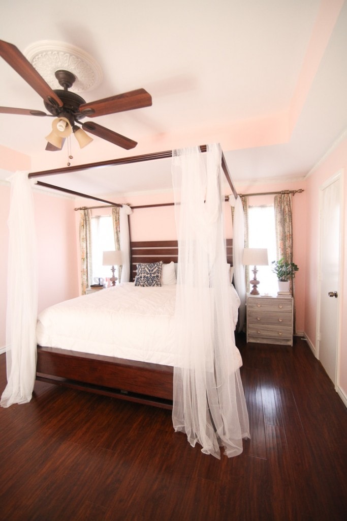
Bedroom
Blues and greens are good color choices for bedrooms or bathrooms because of their calming effect. Soft blues make a room feel serene and have been proven to lower your pulse rate.
Bathroom
Teal and turquoise create a feeling of rejuvenation, helping to reinvigorate and restore balance in your life. Light blues and gentle greens are tranquil and associated with hope and peace. White and gray can create a spa-like vibe in bathroom rennovations like this.
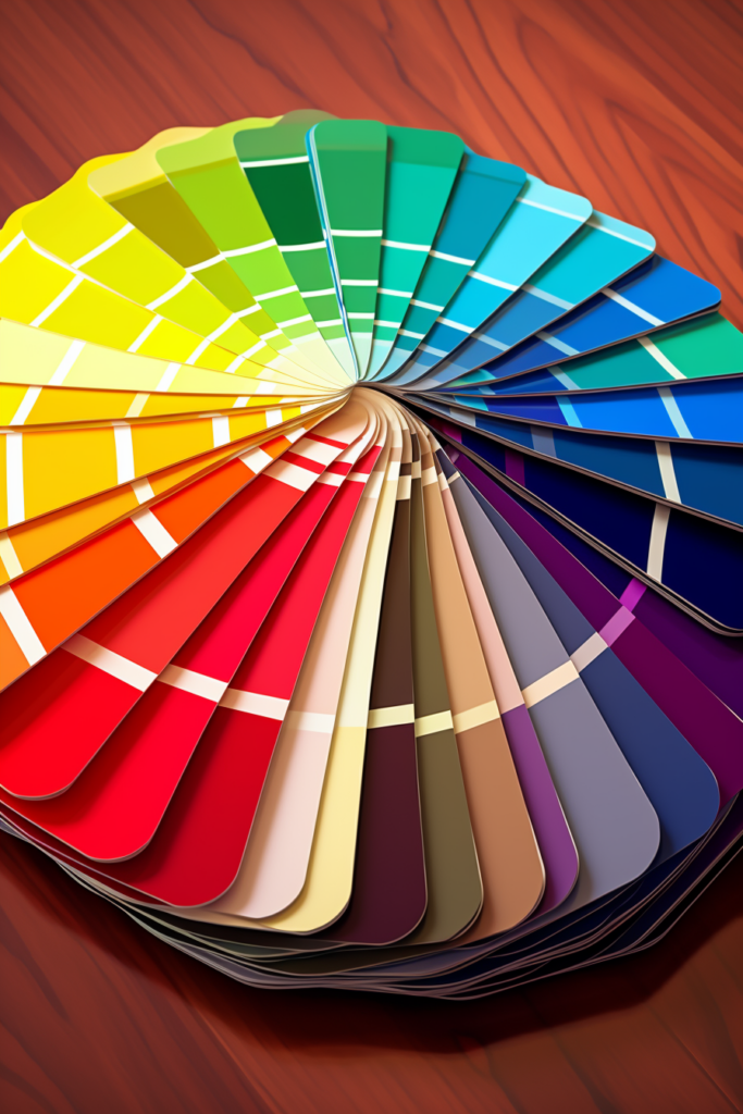
Color Theory
The color wheel shows the relationships between the primary colors red, yellow, and blue, the secondary colors green, orange, and purple, and the tertiary colors, which include six color shades created by mixing primary and secondary colors.
Using the Color Wheel
The color wheel helps us understand color harmony—color combinations pleasing to the eye. There are four basic harmonious color schemes or color palettes:
- Monochromatic colors are hues in different shades, tints, and tones of one dominant color. You can use light or dark colors; white works well in this color scheme. This color scheme is timeless, elegant, and often used in business and design.
- Complementary colors are opposite on the wheel, such as blue, orange, red, and green. Opposite colors are vibrant, especially at full saturation, and provide high contrast. A room decorated with complementary colors radiates high energy.
- Analogous color schemes use colors next to each other on the color wheel. Orange and yellow are examples of analogous colors. They are similar and coordinate well. These colors are often found in nature and are pleasing to the eye.
- Triadic color schemes involve three colors evenly spaced around the color wheel. The strong contrast between the colors makes the bold color scheme popular. The trio of red, yellow, and blue comprise a color scheme that is harmonious and balanced.
Classic Color Rule
The 60-30-10 rule helps create a balanced color scheme in your home. A harmonious color combination is achieved based on percentages.
Dominant Color – 60%
The dominant color is the primary color in your room. It sets the tone and feel of the room and acts as a backdrop for the other colors. This color is most often on the walls or the most significant pieces of furniture.
Choose a color for your walls that reflects the mood you want to create. Neutral colors like beige, gray, and white are popular.
Secondary Color – 30%
The secondary color should complement the primary or dominant color. It’s incorporated in the room 30% or half as much as the dominant color. This color is used on upholstery, accent chairs, or draperies and adds character and depth to the room.
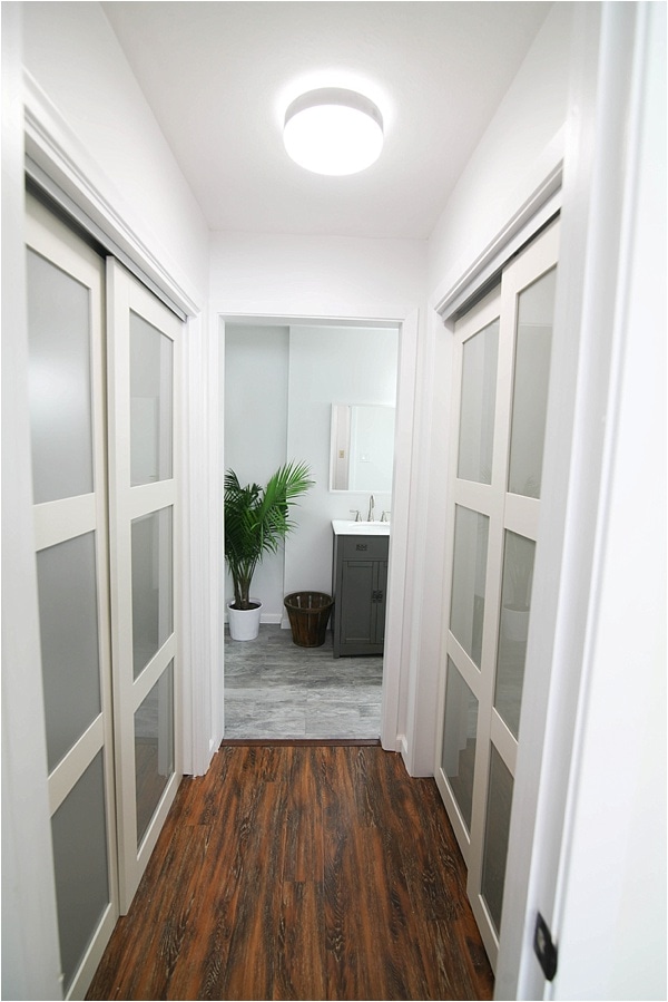
The secondary color is often used for accent walls or adjacent spaces like hallways. It should harmonize with your dominant color but still be distinctive.
Accent Color – 10%
The accent color is the 10% that adds a pop of personality. You will want to use this color for cushions, artwork, and decorative accessories. Select items that reflect your style.
How To Implement the 60-30-10 Color Rule in Home Decor
Once you have selected your color scheme, apply the dominant color to the walls or a large statement piece. The statement piece can be furniture, a large area rug, or a work of art.
The secondary color works best when used in draperies and small upholstered pieces.
For your accent color, select accessories that you love and reflect your personality. Now is the time to choose unique or handmade items.
Popular Color Schemes
Earthy
Natural colors, like moss green, muddy brown, and soft terracotta, create a warm and inviting atmosphere.
Vibrant
Bold colors like magenta, electric blue, or lemon yellow make a dramatic statement.
Light
Soft pastels create a muted, sophisticated tone that makes a room feel peaceful and calm.
Coastal
A combination of soft blues and greens reminiscent of the ocean creates a feeling of tranquility when accented with beiges and whites.
Modern
Shades and tints of blue and gray create a sleek and contemporary look.
Simply Divine
It incorporates pale blues, soft grays, and milky whites to create a feeling of freshness.
Vintage Vibe
Dusty rose, sage green, and antique white are romantic and nostalgic colors that create a vintage flair in any room.
Contrasting
This graphic look is dramatic, modern, and edgy. This color scheme uses black, white, and bold primary colors.
Sunset Evening
Warm oranges, pinks, and purples that mimic a beautiful sunset create a vibrant yet warm feel in a sunroom or kitchen. The colors are joyful and dynamic.
Balanced
Use soft greens, wood tones, and white for a calm and balanced feel. The tranquil colors will promote relaxation.
Sophisticated
The feel of luxury, the color combinations of navy blue, metallic gold, and dynamic black, screams sophistication. Use this palette in the master bedroom.
Selecting Furniture and Décor
Selecting furniture and home décor accessories is both an art and a science, involving personal style, aesthetics, and functionality.
Take time to choose wisely, and you will create a living space that is comfortable, personal, and beautiful. This guide will help you choose pieces that suit your lifestyle and space.
Assess Your Space
Measure your rooms before buying furniture. This will help you choose pieces that fit the scale of the room.
Think about functionality, what pieces you need, and how you will use them. A couple with children would need different furniture than an older retired couple.
The Basics
Pick out the essential pieces first, like a dining room table, a sofa, and a bed, keeping your color scheme in mind. Larger pieces should be a neutral or solid color, making it easy to incorporate accent pieces.
Mix it up. Matching furniture sets can be dull. Select a few unique pieces that speak to you.
Opt for Comfort and Quality
Sit on furniture and lay on mattresses before buying it, if possible, to ensure comfort and function. Buy the highest quality items you can afford, which will last for years and save money in the long run.
Think About the Flow
Arrange your furniture in a way that leaves highly traveled areas open and promotes the flow of movement from room to room.
Add Personal Touches
Accessorize with pillows, throws, vases, and artwork that add color and personality to your rooms. Include unique items that reflect your personal style.
Lighting
A popular trend in ceiling lighting is metallic finishes, which easily fit most color schemes. Select fixtures according to the scale of your room. Add task lighting over kitchen work areas and beside reading chairs.
Creating a harmonious and welcoming environment in your home should start with the color scheme. A personalized color scheme sets the mood and unifies your space. Using the color wheel and considering popular and classic design styles, you can select a color scheme that compliments your space and lifestyle.
Decorate your home with the colors in your selected color scheme according to the 60-30-10 decor rule. Choosing wall colors, furniture, and accessories utilizing this rule will make your home a place you love.
This article originally appeared on Wealth of Geeks.