My Vote for Color of the Year
This post may contain affiliate links. As an Amazon Associate I earn from qualifying purchases.
Along with yesterday’s confessional post, I’ve got another confession to make to you all today. I’m not sure the Pantone team nailed it quite right with this year’s color of the year- radiant orchid. Last year I was on board with the emerald green and of course even painted our front door to match, but I think this unit missed the mark- it reminds me too much of the dusty rose I just had to refloor/repaint and remove from the walls. Blah. Can I nominate my own color of the year? And surprise- it’s not gold. (Gold is color of the decade so we’ll get color of the year to someone else)
Ready for it? Navy.
Yes, navy. I seen this color used in incredible ways and I’m itching to use it myself. I’ve been watching the trend of navy walls quietly pick up of the last few months I’m here to share some of my favorite eye candy with you today. Note- I did try to find the original sources to link back to but in some cases I just couldn’t. If you happen to know where the missing ones came from please let me know! 🙂
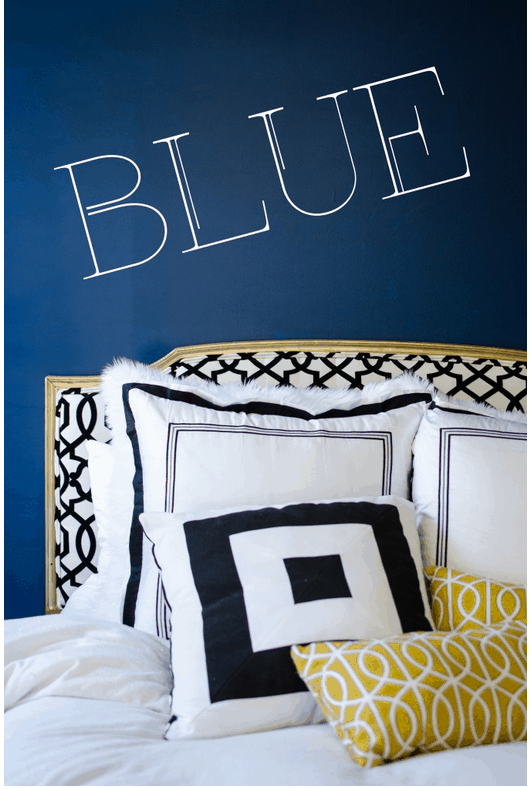
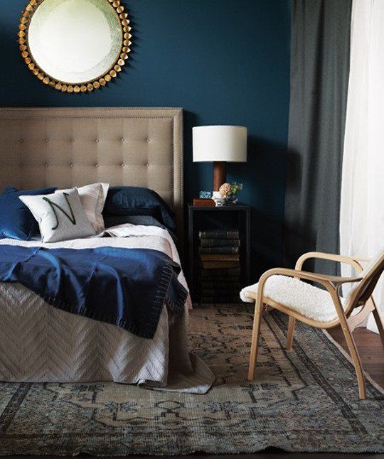
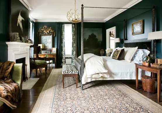
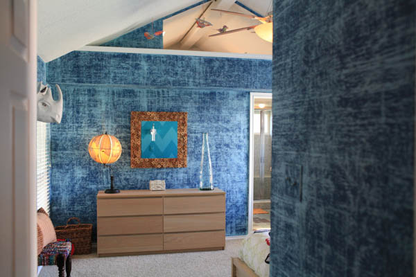
Let’s start with options for the bedroom. Even though I just “went white“, I was seriously considering navy. As with every other color there are shades of navy that are subtle, rich and sophisticated like so:
while others are bold, daring and a little bit more modern:
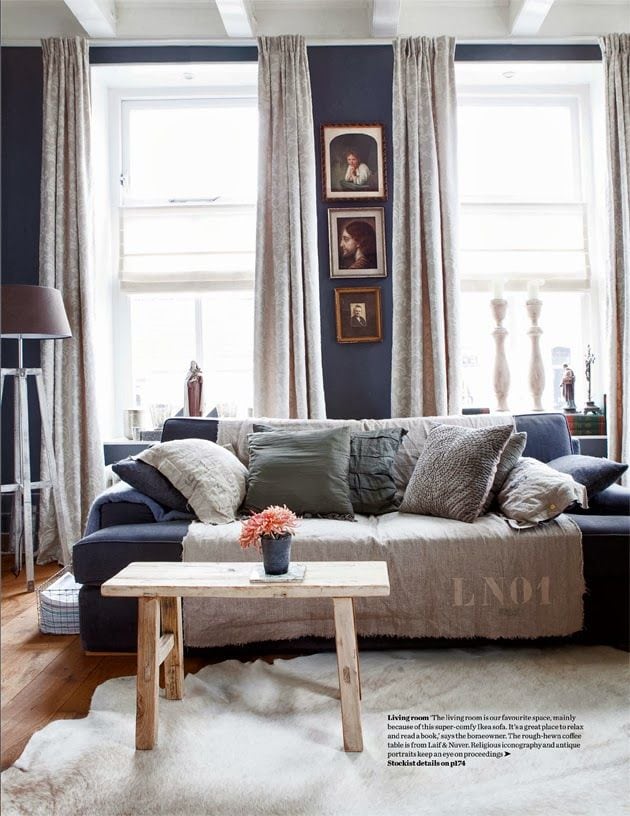
Not sure how you feel about navy in the bedroom? No problem. What about in your living room where you can play up the rustic vibe like so:
or play up the whimsey by adding fun art and accessories, like here:
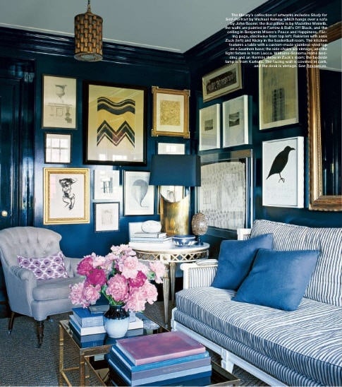 from Elle magazine- no link 🙁
Can I just say that the flowers totally change the mood of the above photo? Cover the flowers with your fingers and look at the photo- it’s almost somber. With the gorgeous floral arrangement however, you start to pick up the lighter undertones in the room- the pillow, the notebook, even some on the wall paint.
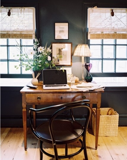
Are you feeling a little non-committal and maybe want to dip a toe into the (navy) water, rather then jump in? What about an accent wall in the stair well (if you have stairs, lucky!), or office?
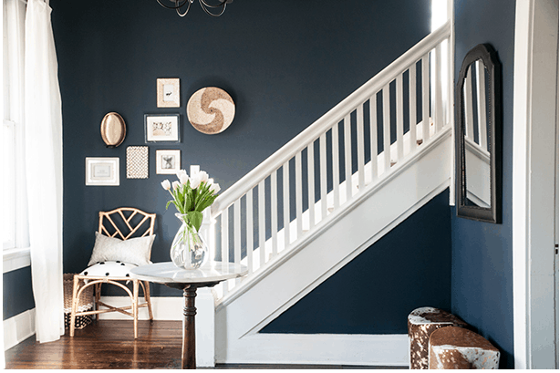
 no link 🙁
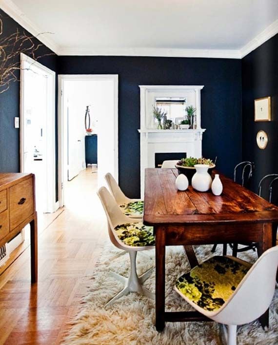
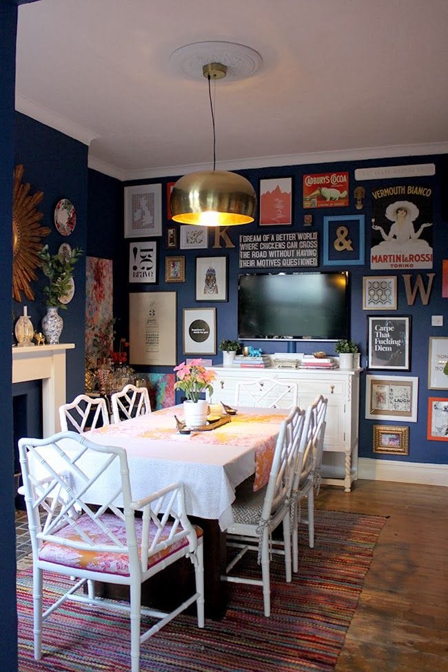
My favorite place I’ve spotted this trend is in the dining room. I absolutely love these photos- and how well gold and navy play together! Fair warning- don’t be surprised if you see this color show up in our house somewhere soon. 🙂
So that’s my current design crush. What about you guys? Are you feeling the navy trend? Let’s paint something. I’m itching to make another change!!!

Hi Tania! I’m with you, Radiant Orchid seems like a very odd if not random choice to me. Makes me question Pantone’s decision process a bit.
I’m glad you’re with me Rachel! I’m also wondering how they came up with R.O. but I’m sure we’ll see it pop up here and there. It’s cute as an accent…to navy! 😀
An intriuguing ddiscussion iss worth comment. I think that
you ought to publish more on this issue, it mmight not be a taboo mattedr
bbut typically folks don’t speak about such issues.
To thhe next! Best wishes!!